 But I would love some feedback...any suggestions? Font? Layout? Placement and color of type? Remember, I don't know how to do much, so stick with the basics or give me directions, friends. And no need to go easy, lemme have it.

Friday, February 26, 2010
Lindsey Powderpuff, Aritst Extraordinaire
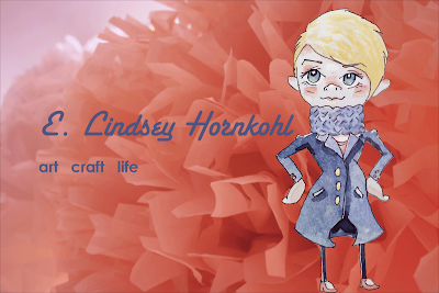
More endeavors to master Photoshop. It's easy when I can import my own little drawings. Of course I'm not doing anything too complicated yet (as you can see here), so excuse my simplicity.
 But I would love some feedback...any suggestions? Font? Layout? Placement and color of type? Remember, I don't know how to do much, so stick with the basics or give me directions, friends. And no need to go easy, lemme have it.
But I would love some feedback...any suggestions? Font? Layout? Placement and color of type? Remember, I don't know how to do much, so stick with the basics or give me directions, friends. And no need to go easy, lemme have it.
Subscribe to:
Post Comments (Atom)
7 comments:
Hi Lindsey! I like the font style and think that it might look nice if you changed it to white.
hi there! i've had photoshop elements for almost a year. and still have no idea how to use it. so i think it looks great! are you using elements or the full version, and how are you going about learning to use it? i need some advice! i'm sure there's video tutorials out there online - that's probably what i need to find, because i often can't translate written directions into actuality, plus using the help menu i don't know the terminology to even find what i'm looking for!
I think it's cute, but I feel that you can probably integrate the drawing more seamlessly into the background (so it doesn't look so stuck-on), you know what I mean?
Perhaps if you added some elements of the pompoms as handdrawn parts behind you, so it would match the background, and then fade it into the background image? I am not sure if I am explaining this too well. I hope I am clear!
This looks great Lindsey! Wow - you did that in Photoshop? I thought you could really only do things like that in Illustrator. I'm impressed.
I do have to agree with Dionne - she's the master at making her own illustrations. Maybe give it some depth. Looks great, though!
Hi Lindsey!
I agree, the font should be white. and maybe larger.
And yes, the handdrawn piece looks a bit pasted on. Perhaps if the background image was some place she could really be standing (like a street scene, for example) you could integrate the drawing a little better.
As it is with that image, i think she should be centered vertically, her feet seem too close to the bottom.
I'm assuming you scanned the colored illustration in and overlayed it on the background? One thing to try next would be to scan in the line art, and color it within photoshop. I have a good technique for pulling line art off the white background into a separate layer-- if you need it, I'll see if i can find it.
Let me know if you need any photoshop tips! The best way to learn is just to keep playing around and trying new things... there are a ton of great tutorials online, just walk through a few.
great work!
nancy
Hey! Thanks for the encouragement! You're so sweet! And I know NOTHING about photoshop, but it looks great to me!
Nicole
Love the illustration. Not crazy about the font. You need something unique, quirky, yet elegant. Would be happy to help. :)
Post a Comment